Olive
'Olive' is an all-inclusive wellness app that provides users the ability to book doctor or therapy appointments, find nearby exercise classes, and more.
Problem Statement
Health and Wellness products have hit the market like crazy in the last 3 to 4 years. With the help from influencers and celebrities, more people are learning about the benefits of self care and are finding ways to stay healthy through mobile and web applications. However, users are downloading multiple apps in order to achieve their fitness and wellness goals, which leads to confusion and sometimes forgetfulness to use the app.
Possible Solution
Users need a digital solution that encapsulates every fitness app onto a single platform, reducing the messiness of having multiple apps open at the same time. An app that allows people to book therapist appointments, see nearby doctors, workout classes, track their health and weight would solve this problem.
Project Duration
60
Weeks
30+
Screens
Tools Used
Design Process
Inspiration
User Research
Competitive Analysis
Conceptualization
Personas
User Flows
Card Sorting
Site Maps
Iteration
Wireframes
Digital Design & Prototyping
User Testing
Inspiration Phase
User Research
Due to a time crunch, I was only able to interview 3 individuals to dive deeper into user attitudes towards wellbeing and health apps. In addition, I wanted to figure out what features these users prioritize.
-
Have you ever used technology to track your wellbeing/health? If so, what did/do you use?
-
If needed, how long does it take to usually get your medical information (test results, shot record, etc.) from your primary doctor?
-
What features do you like about the current workout apps that you use?
-
What are your current health goals? Do you want to lose weight, gain muscle, eat healthier, etc.?
-
Are you a fan of when your current applications sync together? For example, your google calendar and your iPhone’s calendar.
-
What level of comfort would you have if your medical records were accessible on your phone? Does it make you nervous or would it be convenient?
-
What deters you from using any “poorly designed” app? For example, the sign up page takes too long, there is no onboarding process after you create an account, etc.
Information Gained from the Process
-
A "find a therapist" option and even a page to educate users on what therapy is and how they could benefit should appear in the app.
-
Calorie tracking seems to be a feature that the interviewed users would like to continue to have access to
-
Users value convenience over privacy (open to having their records obtainable, but with secure password or FaceID).
-
Users want to see physical results.
-
Users like to be reminded to accomplish their health goals.
-
Users want a simple onboarding experience.
-
Users would prefer minimalistic design with not too much frill.
Competitive Analysis
I wanted my platform to mimic those of other health and wellness apps that were successful. In order to do so, I analyzed two different apps that serve the same purpose. Once that was complete, I moved onto a SWOT analysis to identify strengths and weaknesses of each.
MyMercy
Key Objective
This app is solely for users who are currently enrolled with a primary care doctor through St. John’s Mercy Hospital. They present themselves as a keeper of all records, a place where a patient can find all of their medical records, test results, a list of research studies to participate in, and an option to message any doctor
Wave
“Wave” aims to give users a way to monitor symptoms of any chronic illness a user wants to track through daily journaling prompts, medication reminders and doctor’s reminders.
Overall Strategy
Mercy patients are encouraged to download the app, which is really their only business strategy. They provide a lot of helpful tools to track your health, but really limit their audience.
They are listed in the app store as one of the top downloaded and reviewed apps, but what sets this app apart is that the user can save their own data without having to physically create an account or subscribe and pay a fee to track their wellbeing
Market Advantage
It offers the ability to send messages directly to any doctor, nurse practitioner, or lab assistant. Although it’s not a 24 hour chat line, it allows users to avoid having to call and be put on hold and the receiving end is required to answer within 48 hours.
This app is personal, allowing you to customize how you feel on a day-to-day basis. Not only that, something that I think is a great feature for those who may be visually impaired is that there is a narration option when onboarding. A voice (with text) guides you through creating your profile - this is definitely an advantage in my opinion.
MyMercy
Strengths
-
Required for current patients to download, meaning there will always be a stream of incoming users working the app.
-
There are a plethora of options the user can choose between messaging, making appointments, etc.
Opportunities
-
Open up the sign up portal to out of network patients so that they can import their data and still have the same tracking features
-
Limit the amount of information given up front on the home screen.
Weaknesses
-
Lack of customization within the app, there is no way to journal or take daily notes as seen within competing apps.
-
No advertising or marketing strategy at all.
Threats
-
Apps that allow users to create accounts regardless of their hospital/provider affiliation
-
There is no way to export data or share test results if need be, which is present in other apps such as "Jour".
Wave
Strengths
-
The onboarding process was extremely seamless and easy to follow
-
There are options that revolve around mental health wellness and not just physical health
-
Offers visual representation of the symptoms that users may want to track (charts, bar graphs, etc.)
Opportunities
-
There is an opportunity to restructure the home page, as well as minimize the amount of options on the navigation bar
-
Separating a mental health section
Weaknesses
-
The home page screen could use some reworking in that it should be easier for users to understand where to track their daily mood and symptoms
-
There is no option to message a therapist or medical doctor
-
Weak marketing strategy
Threats
-
There are many threats due to the fact that an app like this is extremely common, and some promoted more heavily than this one.
Conceptualization Phase
Personas
With the information gathered from both the user interviews and competitive analysis, I created a persona who represents who would ideally use this app. Creating a persona allows me to identify pain points and understand their goals.

Marleigh
Barista | 23 years old | Female
Hi, I’m Marleigh ! I’m originally from San Clemente, California, but both my mom and dad are from the same village in Puerto Rico. I have been a barista at my town’s locally owned coffee shop for about three years now. I spend a lot of time on my feet and would like to have an app on my phone that allows me to track my steps each day. It would also be cool to have multiple health tracking features, like daily water intake for
example.
Goals
-
Maintain a healthy weight
-
Increase her steps in a day to 10,000
-
Getting into the habit of doing small, daily workouts
Frustrations
-
Doesn't like apps that have too much "frill" in the onboarding process and interface
-
Apps that don't use FaceID login - she hates login processes that are too lengthy
-
Too many email notifications
Wants & Needs
-
Wants a simple interface that doesn't include a ton of steps to reach her end goal
-
Wants features that tracks water intake and steps taken
-
Notifications/reminders to work out
Other Info
-
Goes to the doctor when needed
-
Has never been to a therapist
-
Does yoga and meditates if stressed
-
No chronic illnesses.
User Flows
Marleigh's persona allowed me to understand what she needs from an application, therefore creating two (2) objections within the interface.
Information Gathering (#1)
-
Marleigh wants to start using Olive and have an all-in-one place to track her health.
-
He will know this task is finished once he has the abillity to login.
-
Marleigh is already an avid phone user, so she knows how to create accounts on multiple software (as long as the process isn't lengthy)
Task Flow (#1)
Entry point: Download and open the app
Success criteria: Have an Olive account made with the information provided
-
Open the app
-
Select the option to create a new account
-
Input her first and last name, as well as a profile picture (optional)
-
Add a password and option to use FaceID
-
Allow notifications
-
Create account
-
Return to home screen and start onboarding process

Information Gathering (#2)
-
Marleigh has been prompted to being the task because she wants to start inputting information into the newly downloaded app.
-
She will know this to be finished when all of her information is correctly inputted under the "Profile" section.
-
Marleigh is already familiar with the pre-downloaded apps, so she has knowledge of how to use that kind of technology.
Task Flow (#2) - Add Medical Data to Profile
Entry point: Logging into the app
Success criteria: Marleigh will know she has successfully completed the task when she can view her profile and see that the changes to her medical history have been made.
-
Open the app
-
Log in
-
Go to user's profile
-
Find where to add medical information
-
Determine which information she wants to input
-
Add info
-
Save

Card Sorting
I conducted an open card-sort with five individuals in order to get an idea of how I should categorize and organize the pages within my app. To complete this task, I utilized "Optimal Workshop"'s Card Sort feature, which allowed me to send a shareable link to the selected participants. This feature made for a fast and easy to explain process.
I added a total of 19 cards to my card sort. I wanted the cards to be more category-specific to see if they would make sense to the user.
5
of 8 participants completed the study.
4m 18s
Average time to complete the study.
United States
Participants were all from the United States.
The Cards
Message Doctor
Add Doctor
Add Medication
Find a Therapist
Remove/Edit Doctor
Chat with Therapist
Remove/Edit Medication
Chat with Doctor
My Claims
Pay Claims
Water Intake
Add Snack/Meal
Claims Due Soon
Edit Insurance Info
Nutrition Classes
Gyms
Add Credit Card
Edit Billing Address
Edit Contact Info
The users created a total of 17 categories with a median of 3 each. Although slightly named differently, the categories coincided with one another, which makes it easier for me when creating a site map. The name of the categories that are similar to each other were care givers/doctor info/info and my info/to do.
Dendogram Results

100% of the participants agreed that water intake, add snack/meal, nutritional classes, and gyms should be categorized under its own label. It also suggests that the Therapist Help and Doctor Help be separated into their respective categories and should not overlap.
The Contact Information and the four purple lines at the bottom seem to be a struggle for the participants to put in a group, but the overall trend suggests that they feed into a "My Info" category.
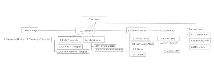
Site Map
Iteration Phase
Wireframing
Now that I've finished with the card sort, I'm able to start putting the pencil to the paper. I created lo-fidelity wireframe of the navigation page.


Digital Design
With this design in mind, I switched to a higher fidelity wireframe to organize my thoughts more clearly.
The user selects one of the options under the dropdown item list - they can search either by Hospital, Provider or Specialty.
A list of available providers will pop up here and the individual has the opportunity to select who they'd like to add.
A brief summary of the chosen provider with their location, messaging option, and Hospital's website will pop up.


User Testing
Usability Test Plan
Before I started finding participants to be a part of my study, I needed to organize my thoughts and understand how I would measure the results.
I decided that I wanted to use my Adobe XD prototype and record each participant’s reactions and “walk through” on my iPhone’s recording app.
The goal was to see where the problems surfaced in my prototype and the overall ease-of-use my app. In addition, I had four main test objectives in mind:
1. How easy is it for users to create an account without seeing the app?
2. Does the layout of the app’s home screen make sense?
3. How are the users perceiving the app?
4. Does the navigation menu cover all of the necessary components users would want in a wellness app?
Testing and Results - Rainbow Test and Affinity Mapping
Transforming my results into quantifiable data was the hardest part of this process, but by using an affinity map and Rainbow Spreadsheet, I was able to do so.
The affinity map (pictured on the right) was used to categorize all of the errors, observations, and quotes from each of my test subjects. The most time-consuming part of this process was listening to the recordings I had with meticulous detail in order to not miss anything valuable.
The rainbow spreadsheet, pictured below, is by far my preferred method of organizing utility test results. By being able to visually see how many people struggled with the same task, I was able to prioritize these changes.


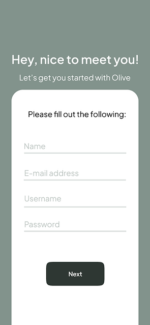
The main goal of this test was to see which introduction screen users preferred, and if they preferred having more sign up options or just one. 6 out of 10 individuals preferred the first screen as one individual described it as “more professional” than the other option.
Implementing Feedback
It was finally time to give Olive its final makeover. I've decided to select the following three components of Material Design to incorporate in my current prototype:
-
Bottom Navigation Bars
-
Text Fields
-
Buttoms


Concluding Thoughts & Challenges
While my time working on Olive's design was mostly fun, I had never been in a position where my design had failed to reach the audience's goals. It took me longer than expected to re-do wireframes, conduct tests, and create a working prototype. Although at first it was discouraging, I learned that the user comes first in these situations.
Receiving constructive criticism is something that I now encourage my peers to provide me. Not only does it help me become a better UX designer, it also helps me grow as a person.
After hours of staying up past my bed time (usually 8 pm sharp), I am proud of myself and thankful that Career Foundry has given me and others an amazing education.
Here's to the future!